
Intro
A very common way of styling your SharePoint Framework React components is through the css (to be precise sass, which eventually compiles to css). Actually, SharePoint Framework goes one step further and suggests something called css-modules. As you know, for a default web part we have a file called <Component Name>.module.scss. We write styles in that file and SharePoint Framework build pipeline generates corresponding TypeScript interface for us to use inside React component as
className={styles.myButton}
SharePoint Framework ensures that a class name will be unique, that way we isolate our styles from the "outside world" and have them scoped to this specific component:

However, it's not the only way of styling your components using isolated scopes. Nowadays the approach when you write your css styles in code (in .js or .ts files and not in .css or .scss) becomes more and more popular and has a number of benefits:
- automatic local scoping of your components
- code intellisense and suggestions, type validation (when used with TypeScript)
- you don't depend on build-time css compilers like sass or others - faster builds
- no issues with css specificity
- your styles might depend on runtime variables - like disabled, hidden, i.e. state-based styling
- easier refactoring/renaming of classes
- easier style reuse and mixins
They have disadvantages as well, like
- learning curve
- code readability
- an extra layer of complexity
- performance in some cases
All in all, it's a debatable topic and a matter of preference, whether to use it or not.
As usual, you can find the source code in the corresponding repo - spfx-css-in-js.
CSS in JS
In react you write your markup in TypeScript/Javascript, so why not write styles in the same way? This technique is called "CSS in JS" and includes different approaches to describing your css styles in code. It also incorporates a set of different libraries, which implement CSS in JS ideas.
I would divide those libraries into two main categories:
- those which solely generates unique class names based on the css styles (TypeStyle, Aphrodite and others)
- those which provide you with full-fledged styled-components and/or class names generation (styled-components, Radium, and others)
CSS in JS with SharePoint Framework
It's relatively easy to get started with CSS in JS and SharePoint Framework. Let's try to create a very basic button with styles, created using CSS in JS approach. For this sample, I'm going to use the TypeStyle library. Why? Because
- it's TypeScript based with great intellisense support
- created and supported by a very well known TypeScript contributor @basarat (and also @blakeembrey who is the author of dependency heavily used inside TypeStyle) and great community contributors
- has rich API - mixins, pseudo-classes/selectors, media queries, animations and others
- fast and small
- generates only unique css class names (I don't want to make things more complicated with styled-components)
Install the library
You know what you need to do for installation, but just for the sake of completeness:
npm install typestyle --save
Write your styles in TypeScript
Now it's a bit tricky because you have different options here. My approach is very simple and straightforward:
- Create a new file, say TypeStyleButton.styles.ts
- Use stylesheet API to create an object of reusable styles
- Use root as a name for your top-level tag
- Use semantic names for your child tags, i.e. folderItem, text, profilePicture, footer, etc.
- Don't use tag selectors or use them in extremely rare cases
Having that in mind, our TypeStyleButton.styles.ts might look like this one below:
import { stylesheet } from "typestyle";

export const styles = stylesheet({
  root: {
    margin: "10px",
  },
  myButton: {
    backgroundColor: "#328bf9",
    color: "#FFF",
    height: "60px",
    lineHeight: "60px",
    textAlign: "center",
    fontSize: "16px",
    padding: "0 15px",
    cursor: "pointer",
    borderWidth: "0 0 6px 0",
    fontWeight: "bold",
    borderColor: "#4e84c3",
    borderStyle: "solid",
    $nest: {
      "&:hover": {
        backgroundColor: "#328bf9",
      }
    }
  }
});
Apply class names to React component
Now as we have our styles, let's add them to the component:
import * as React from 'react';

import { styles } from "./TypeStyleButton.styles";

export const TypeStyleButton: React.FC = () => {
  return (
    <div className={styles.root}>
      <button className={styles.myButton}>Hello from a TypeStyle button!</button>
    </div>
  );
};
The styles variable holds the references to our defined classes, i.e. root and myButton. So we simply need to apply them to the corresponding tags.
What about theming?
What if I want to use the same theme colors, as my current SharePoint site uses? In default HelloWorld.module.scss file you might notice below styles:
background-color: $ms-color-themePrimary;
which get transformed to css:
background-color: "[theme: themePrimary, default: #0078d7]";
Then, in runtime SharePoint Framework will replace this placeholder with a real theme color value. But we can't do it in our styles.ts file.
Fortunately, there is a way to extract theme information using SharePoint Framework's ThemeProvider.
In the OnInit method we can get a reference to our current theme object and subscribe to theme change event:
  protected onInit(): Promise<void> {
    this.themeProvider = this.context.serviceScope.consume(ThemeProvider.serviceKey);
    this.theme = this.themeProvider.tryGetTheme();
    this.themeProvider.themeChangedEvent.add(this, this.onThemeChanged);

    return super.onInit();
  }
Why a theme change event is important? Because it allows us to listen to changes in section backgrounds and react immediately. Read more here - Supporting section backgrounds. Don't forget to set "supportsThemeVariants": true, in your webpart manfiest.json file to make it work.
The handler simply sets a new theme object:
 private onThemeChanged(args: ThemeChangedEventArgs) {
    this.theme = args.theme;
    this.render();
  }
Now we should somehow pass the theme object to our web part. One option would be using web part props, but it's very common, that we need theme object many levels deep nested in the components tree. In that case, it's better to use react context API to store the theme in a global context. Then each individual component can easily access the theme object and, what is also important, receive updates to the theme object when we change it dynamically.
The context:
import { createContext } from 'react';
import { IReadonlyTheme } from '@microsoft/sp-component-base';

const AppContext = createContext<{ theme: IReadonlyTheme }>(undefined);

export default AppContext;
and webpart render method:
import { ThemeProvider, IReadonlyTheme, ThemeChangedEventArgs } from '@microsoft/sp-component-base';
import * as strings from 'DynamicTypeStyleWebPartStrings';

import { StylesDemo } from './components/StylesDemo';
import AppContext from '../../common/AppContext';
....

public render(): void {
    const element: React.ReactElement = React.createElement(
      AppContext.Provider,
      {
        value: {
          theme: { ...this.theme }
        }
      },
      React.createElement(StylesDemo)
    );

    ReactDom.render(element, this.domElement);
  }
The next thing is to make our .styles.ts aware of the theme variable. We can do it by returning back a function, which accepts a theme object, instead of returning a direct value:
import { stylesheet } from "typestyle";
import { IReadonlyTheme } from "@microsoft/sp-component-base";

export const createStyles = (theme: IReadonlyTheme) => {
  return stylesheet({
    root: {
      margin: "10px",
    },
    myButton: {
      backgroundColor: theme.palette.themePrimary,
      color: theme.palette.white,
      height: "60px",
 .....other styles
    }
  });
};
Take note of how I use theme.palette inside my TypeScript styles.
Now you might be tempted to call this function directly from your React component, pass the theme and that's it. While it will work, this approach has some performance issues.
The reason is, that all CSS in JS frameworks use approach when they generate a unique string hash based on a style object. Generally, this hash function is fast, however in cases when you have hundreds of components on a page it might lead to some performance degradation.
That's why it's better to call this function only when our theme is changing. For that purpose, I created a custom react hook.
If you want to learn more about react hooks in the SharePoint Framework world, read my other post SharePoint Framework and React hooks. Should I care?
The hook generates styles variable only when theme is changing:
import { IReadonlyTheme } from "@microsoft/sp-component-base";
import { useEffect, useState } from "react";

export const useThemedStyles = <T>(theme: IReadonlyTheme, createStyles: (theme: IReadonlyTheme) => T) => {
  const [styles, setStyles] = useState<T>(createStyles.bind(null, theme));

  useEffect(() => {
    setStyles(createStyles(theme));
  }, [theme]);

  return styles;
};
and finally, our react component will look like below:
import * as React from 'react';
import { createStyles } from "./TypeStyleButton.styles";
import { useThemedStyles } from '../../../../hooks/useThemedStyles';
import AppContext from '../../../../common/AppContext';
export const TypeStyleButton: React.FC = () => {
const { theme } = React.useContext(AppContext);
const styles = useThemedStyles(theme, createStyles);
const [enabled, setEnabled] = React.useState(true);
const toggleEnable = () => {
setEnabled(!enabled);
};
return (
<div className={styles.root}>
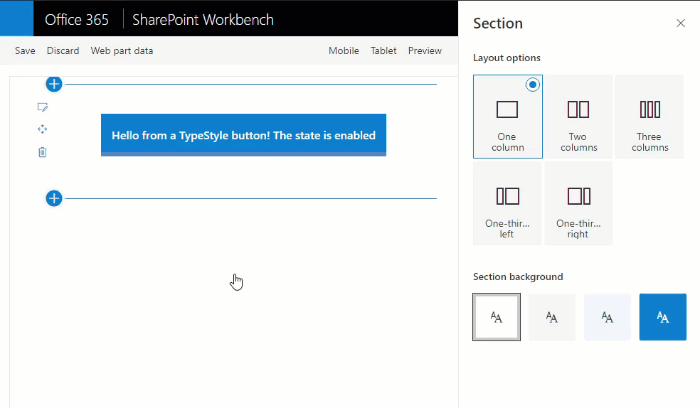
<button onClick={toggleEnable} className={styles.myButton}>Hello from a TypeStyle button! The state is {enabled ? "enabled" : "disabled"}</button>
</div>
);
};
Now you can change background section styles and your webpart will react accordingly:
How to add other components? The flow is fairly simple:
- Create a <component>.styles.ts file and export createStyles function (which is theme-aware)
- Use useThemedStyles hook to get styles and pass the theme object from a global store.
Using the above approach you will not have any performance issues.
You can find the source code at my spfx-css-in-js GitHub repo.
Conclusion
You are not limited in styling your components only with built-in css modules and saas. You can also easily adapt modern CSS in JS approach in your SharePoint Framework code base and start using it.
Microsoft MVP Andrew Koltyakov has published a great sample of SPFx webpart with styled-components recently. Check it out as well.
To add to the picture, the Office UI Fabric React team (oh no, sorry, Fluent UI Team 😉) also uses CSS in JS approach (they used to use saas, but then switched to CSS in JS) for styling components. The same way you apply custom css styles to Office UI Fabric React components through the CSS in JS approach (styles property). You can even use the same pattern in your code, however, the documentation is quite poor on this topic and API quite limited when compared to other CSS in JS libraries. I concluded that it's rather for internal use, then for everyone.